Which “Berry Face” Cover Do You Prefer?
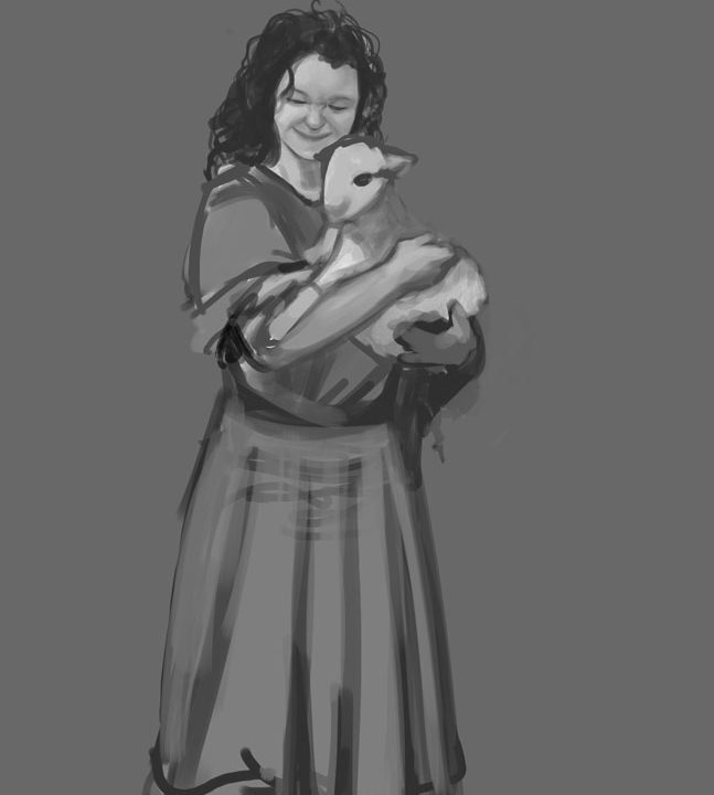
Here are the two versions of the cover for “Berry Face,” book two of the children’s series “Sharp teeth, Flat Teeth.” After we decide which one to use, we’ll make a minor adjustment (remove the artist’s signature on the bottom of the brown-ish version; adjust the main title placement on the blue-ish version.) Now that you see the layout, which do you prefer?


